May
For me, spending more time at home means spending more time on projects.
The problem is – I seem to have finished all of my projects. All my yarn has been crocheted, all garments sewn, and all DIY’s done.
So I had to really rummage through my craft drawer to come up with some new projects and DIY’s to do.
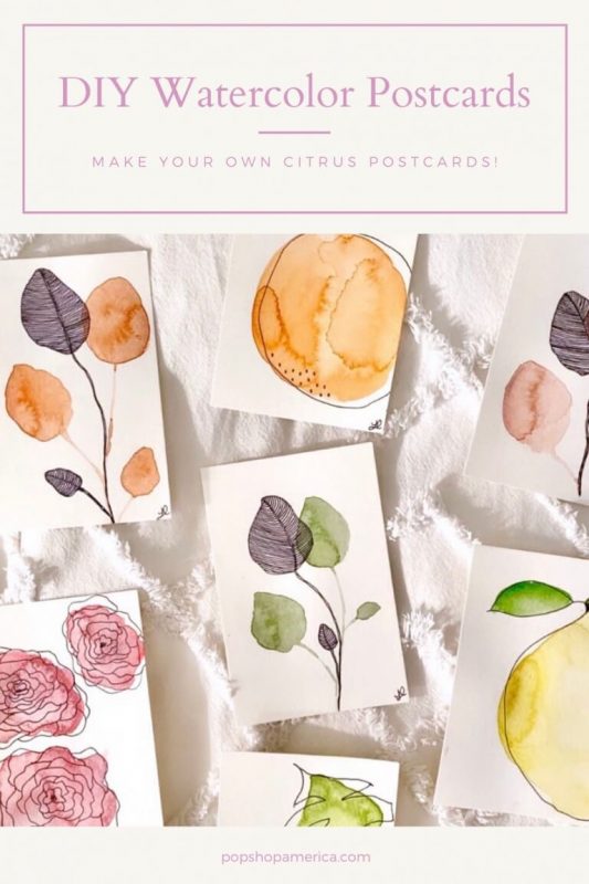
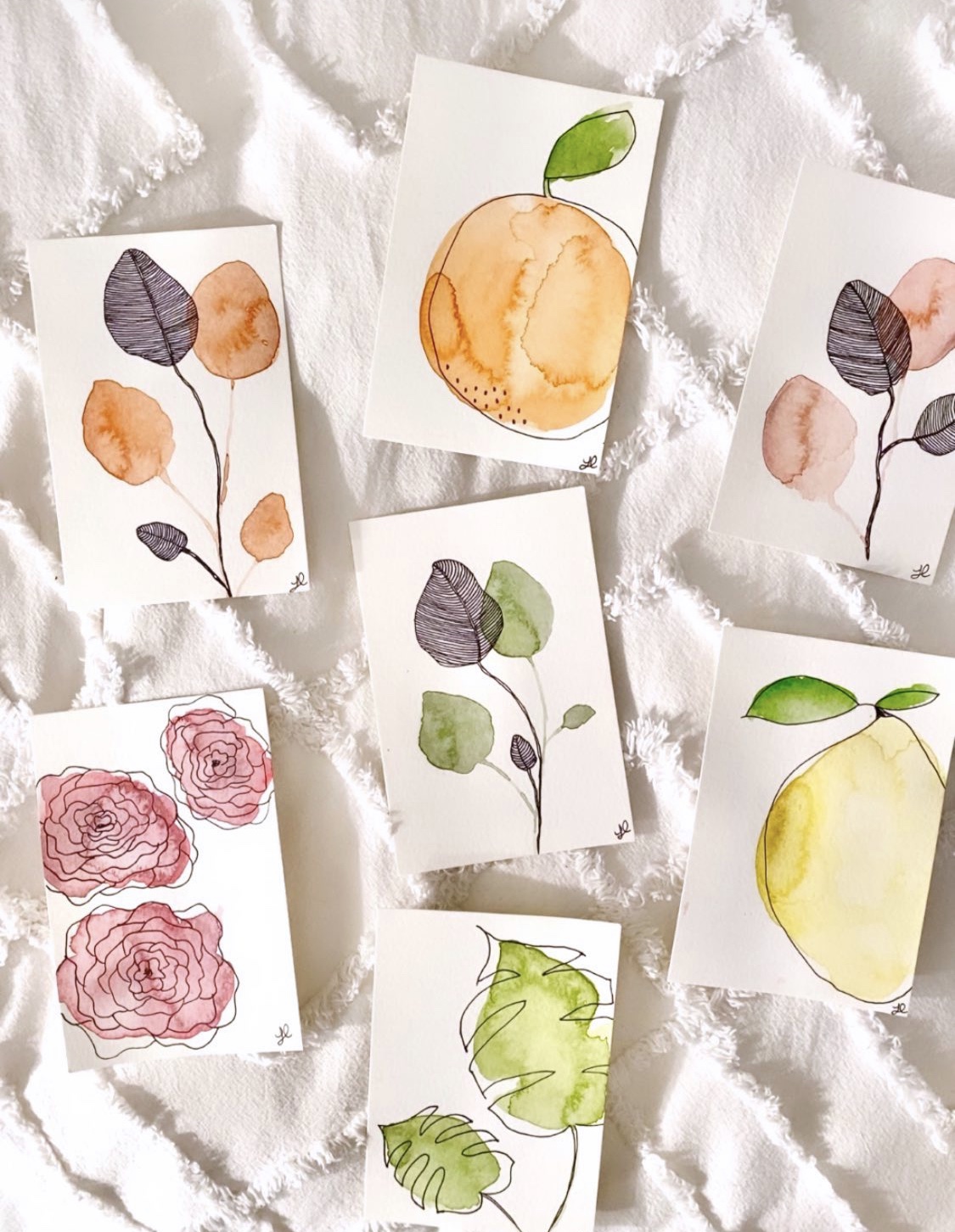
During my rummaging, I found an old Winsor and Newton watercolour pad of postcards which got me thinking, what if I painted these and then sent them out to friends and family?! I loved how cute the idea was and immediately set down to paint some postcards.
I’m a huge fan of watercolours and tend to paint with those, so I looked up some inspiration images on Pinterest and started painting. When I was done, I had improvised most of the cards with plants and flowers, but loved the results. I wrote personalized messages to each friend or family member on the back of the card and sent them off!
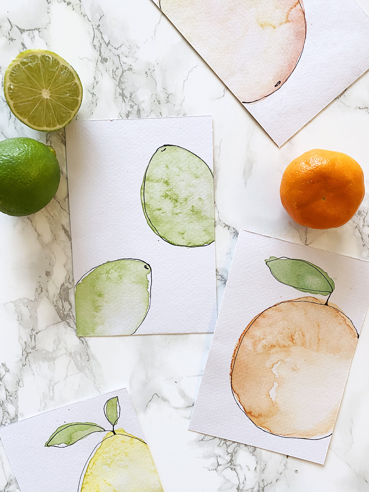
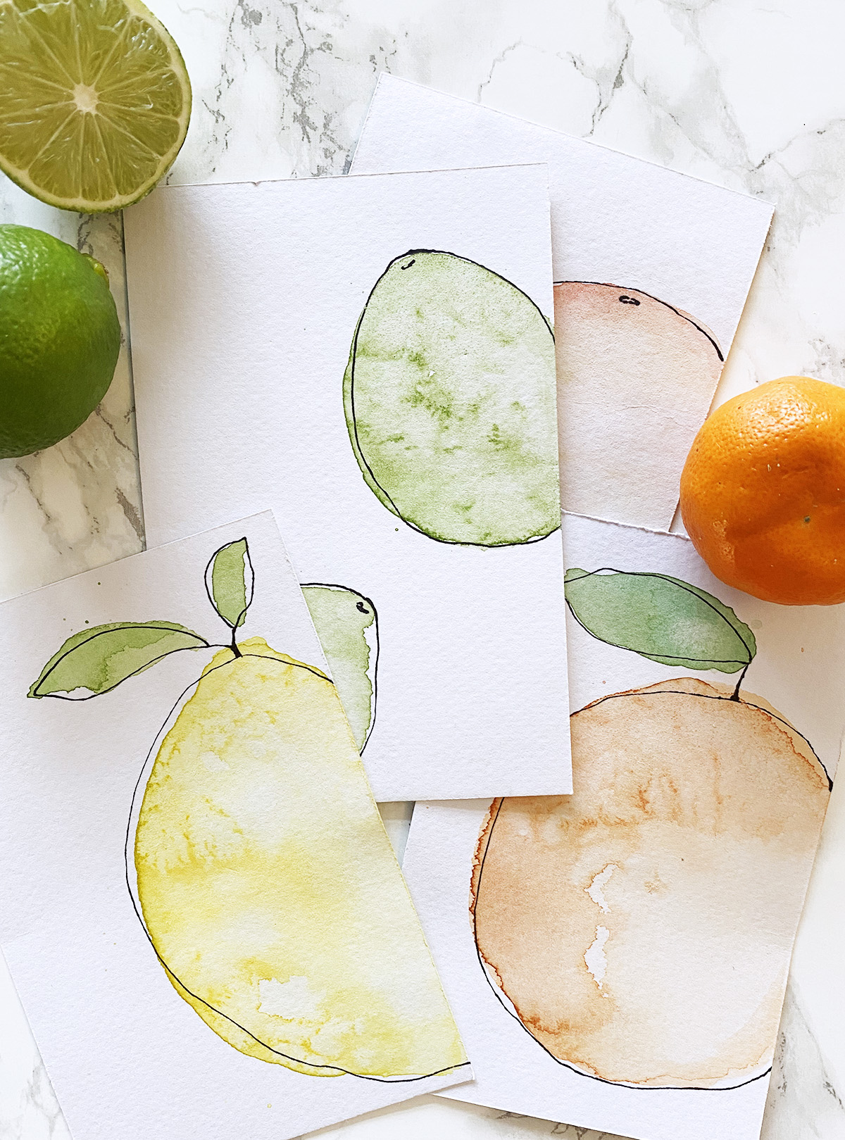
I posted this story of all the cards to my Instagram and people loved them, so I decided to do a tutorial to show you how to paint your own! The citrus was my favourite, so I focused on a citrus-themed postcard collection for you to recreate!
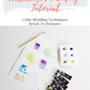
For this tutorial, I painted on a lighter weight of watercolour paper, but I do recommend painting on something that’s at least 300gsm because it holds the water a lot better and gives you that classic kind of water-stained look of the different pools of colour.
If you have watercolour paper, but don’t want to buy watercolour postcard paper, I’d suggest just cutting up your watercolour paper into a 4×6″ rectangle and just write your note on the back making sure to leave room for a stamp and an address! I’ve been trying to work with what I have during this pandemic, so I’d encourage you to do the same!
DIY Watercolour Citrus Postcards
Supplies:
– watercolour postcards (these are the ones that I bought) OR cut out 4×6″ rectangles of watercolour paper that’s at least 300gsm
– watercolour paints (I love and have this set from Winsor & Newton)
– a medium-sized round paintbrush
– paper towels
– a cup filled with clean water
– salt (optional)
– a thin black sharpie marker
Instructions:
- I started by mixing my paints. I knew I would need a pinky-red, an orange, a yellow and a green. I mixed just the pinky-red, yellow and green knowing that I would make orange later with the yellow and pinky-red. When I mixed my paints, I toned them down a little bit so that they weren’t such bright primary colours, which I think makes them look a little more refined and less childish. In order to tone the colours down, you want to add a very small amount of the complementary colour. So for the green, you would add a very small bit of red, for the yellow a small bit of purple and for the pinky-red a small bit of green. I’m talking super small amounts here, just enough so that it takes off the edge and dulls the colour slightly. I’d also suggest mixing the paints so that they’re not super pigmented – you just need a little bit of colour here.
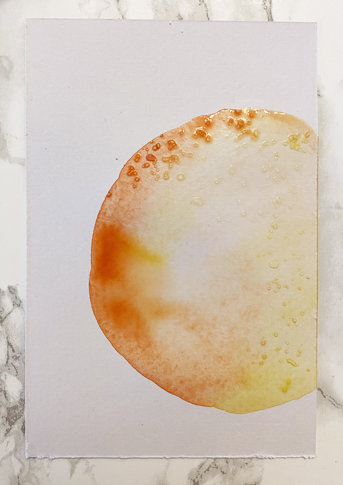
- Once you have your paint mixed, we’re going to start with painting the grapefruit. I like to add a wash of colour to the page and then go back and add more paint to darken areas or use my paper towel to blot the page and take away paint. So starting with your pinky-red colour, draw the outline of your grapefruit in a fairly round shape. Try not to make it a perfect circle though, the imperfections add to the appeal of these paintings! Before you get to the end, switch to the yellow colour and finish drawing your grapefruit outline. I chose to paint my fruits so that only about half or 3/4 of each can be seen, which I think also looks a little more visually appealing.
- Once you have your outline, go back with your pinky-red and start shading in the grapefruit. Alternate between the pinky-red and the yellow to get an uneven look that mimics the skin of grapefruit. This is what my first layer of paint looks like:
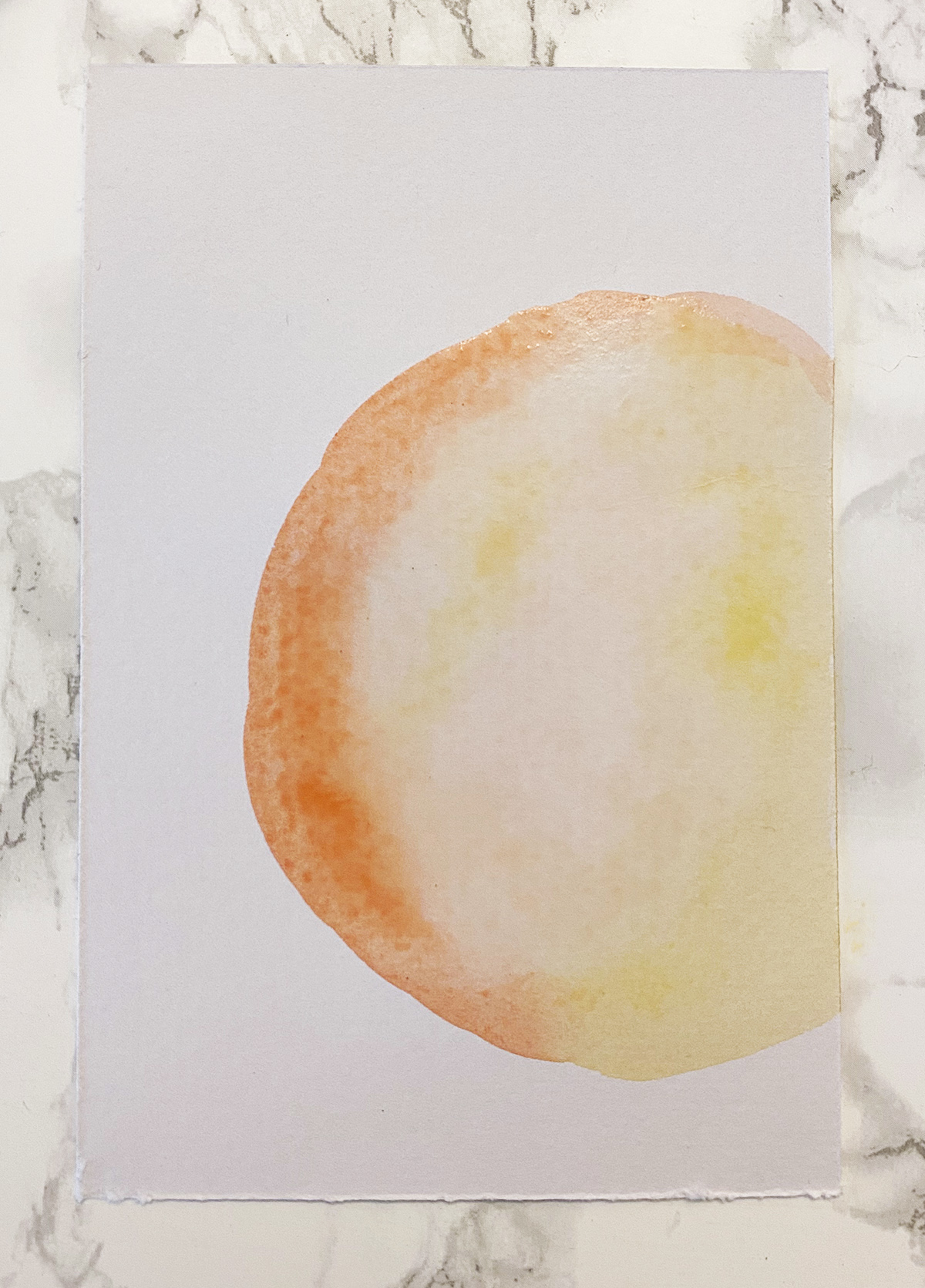
- After you have your first layer, go back and add dabs of pinky-red to make it darker, add spots of yellow and even try adding droplets of clear water with your paintbrush anywhere that you want there to be less colour, or get rid of it altogether by blotting with your paper towel. After I added my second layer of colour, my grapefruit looked like this:
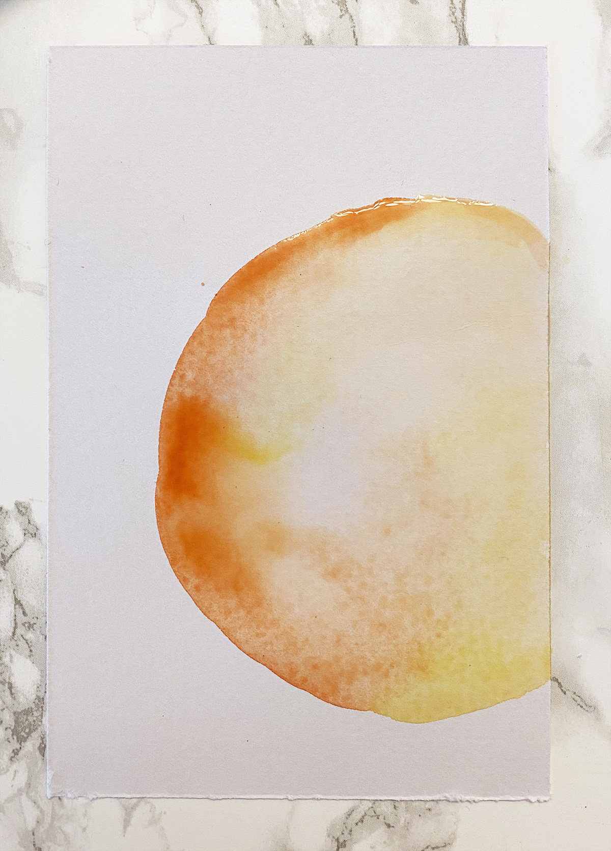
- Continue adding more colour until you feel that your grapefruit is colourful enough.
- Set your grapefruit aside to dry – but keep an eye on it! When it’s almost dry, we’re going to go back and add some salt to make a cool looking texture.
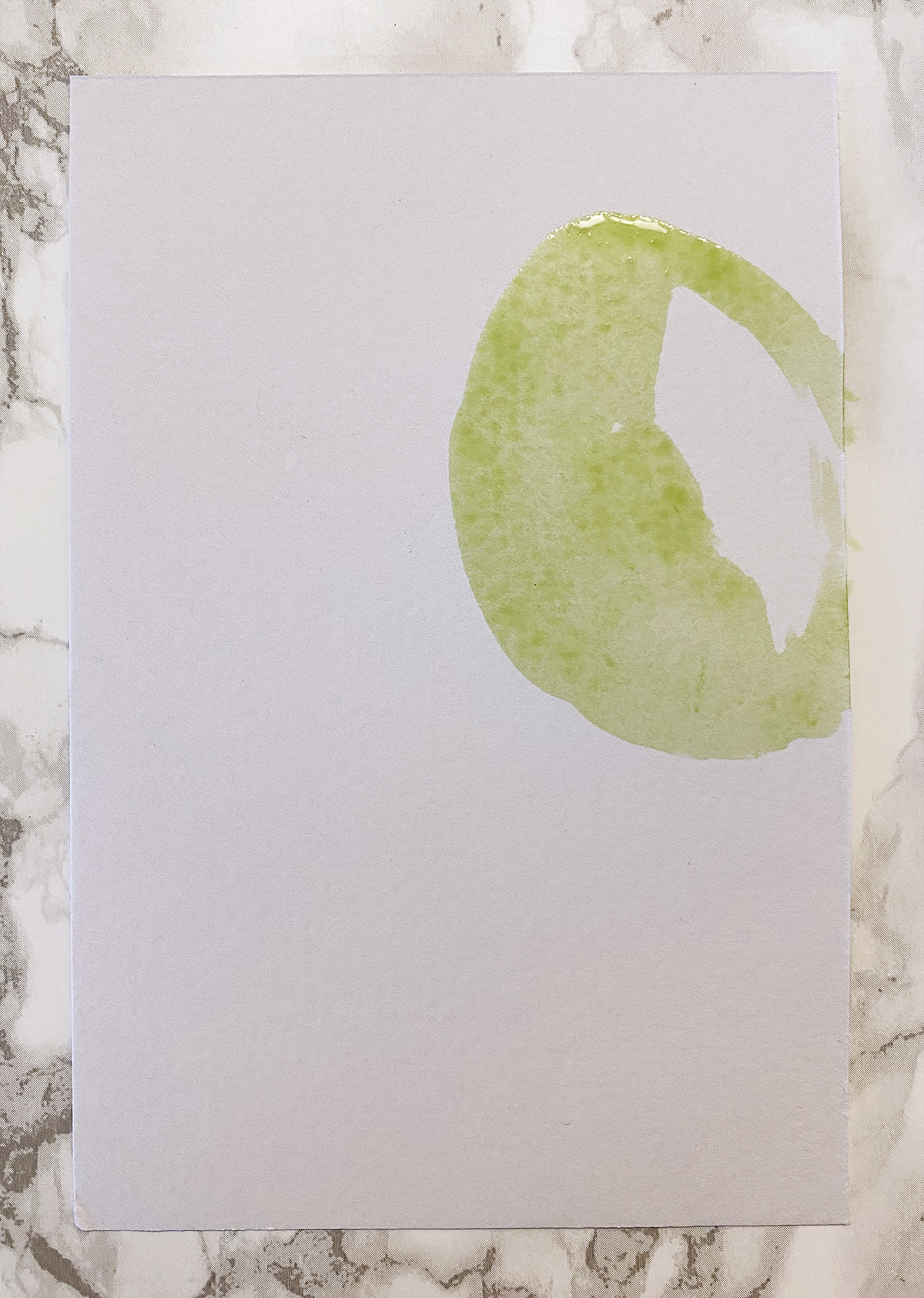
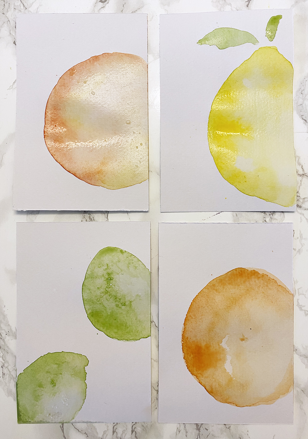
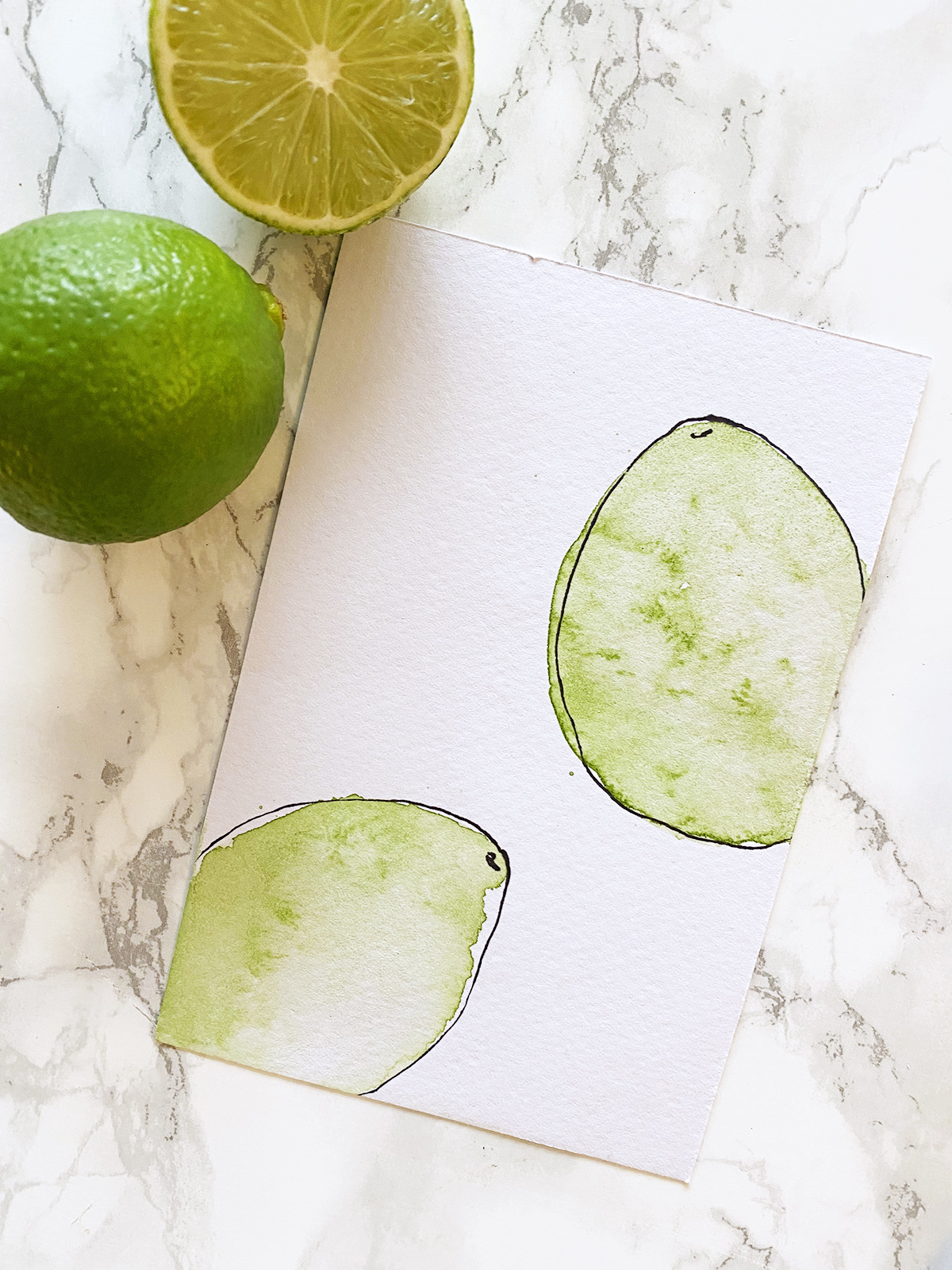
- Next, I moved on to the limes, which are a bit easier because they’re only one colour.
- Start the same way as your grapefruit by tracing an outline and then start to shade in your first layer of colour with your green paint, leaving some white space for contrast. Here’s how the first layer of my lime looked:
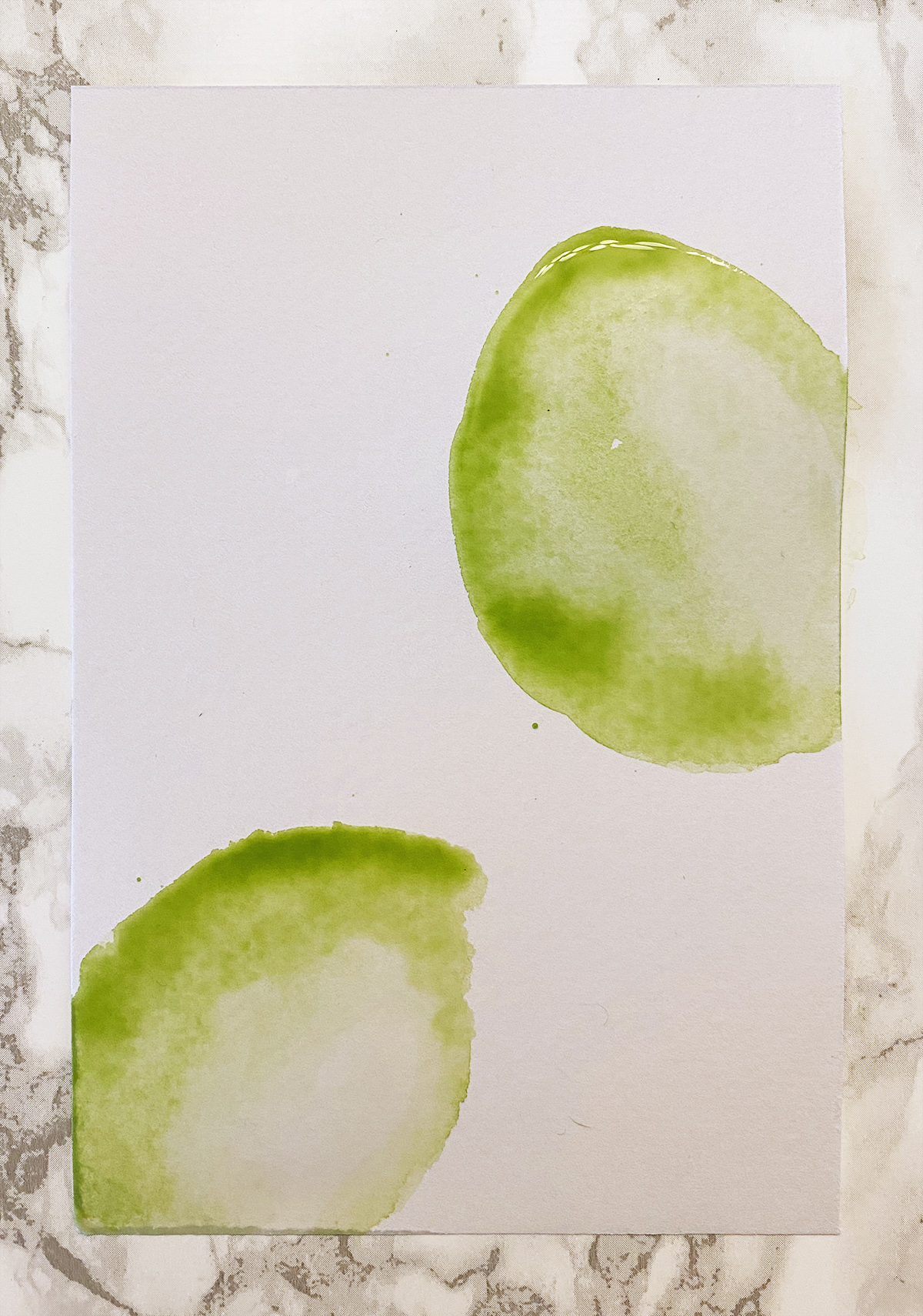
- For the second layer of the lime, I added another layer of green over the first and added clear water over the white space that I left. The pools of coloured and clear water will eventually meet and blend on their own. Continue adding or blotting away paint until you’re happy with the result. Set lime aside to dry
- Continue on with the lemon and the orange using the same technique as the lime. I chose to add leaves to mine as well, so feel free to do the same!
- Once all 4 of my postcards were done, I went back to the grapefruit one which was almost dry and sprinkled some salt over the highly pigmented areas. The paper needs to be slightly damp for this to work, but not too damp as nothing will happen – that’s why we waited for it to dry a bit.
- Keep an eye on your other paintings and add some salt when they’re only slightly damp.
- After about an hour your paintings should all be dry. Brush the salt off of your paintings if you chose to use it.
- Mine were all a bit wavy, so I kept them under a couple of heavy books overnight so that they would be nice and flat when I sent them out.
- Once your postcards are flat, it’s time to add the black line drawings.
- For the line drawings, I used a thin tip sharpie marker and just loosely drew around the outline of each fruit, making sure that I was both inside and outside the lines so that it made a fun, organic shape and keeps the fruits from looking like cartoon drawings.
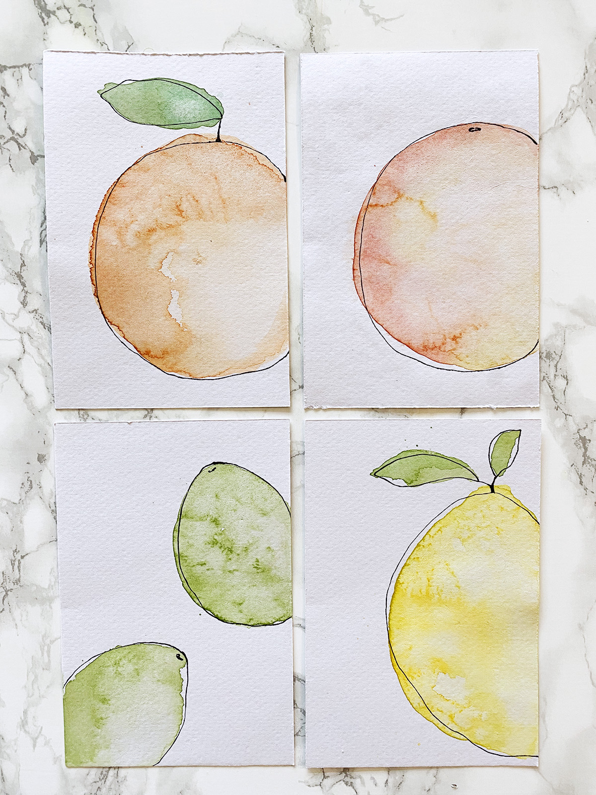
- You can go in and add some detail in the leaves if you want or add a couple of dots to the skin of the orange – whatever you feel like doing!
- Now, your postcards are ready for a nice message on the back and can then be stuck in the mail!
I had a lot of fun doing this project and it’s really encouraged me to get my paints out more often!
I just sent my postcards out yesterday, so I don’t think anyone has gotten them yet but I hope that when they do it brings a small bit of joy to their day!
Hope you enjoy this project!
- Tess
Let’s Be Friends!
Insta | Pinterest | Enews | TikTok